

1. PageSpeed Insights
The first and easiest way is to go to PageSpeed Insights. Now you just plug in whatever page you’re interested in, and it’s going to return some of the CrUX metrics along with Lighthouse and a bunch of recommendations about how you can actually improve the performance of your site. That’s really useful, but it just kind of provides a snapshot rather than it’s not really good for ongoing monitoring as such.
2. CrUX dashboard
Another way that you can access CrUX data is through the CrUX dashboard, and this provides all of the five different metrics from the CrUX database. What it does is it looks at the percentage of page loads, splitting them out into slow, average, and fast loads. This also trends it from month to month so you can see how you’re tracking, whether you’re getting better or worse over time. So that’s really good. But the problem with this is you can’t actually manipulate the visualization of that data all that much.
3. Accessing the raw data
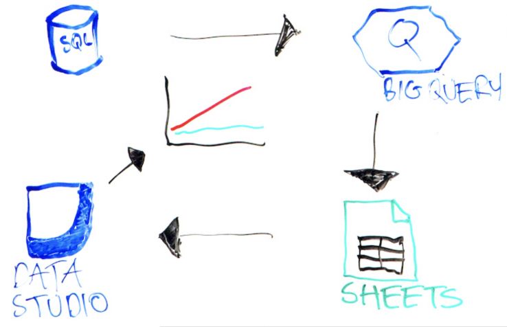
To do that and get the most out of the CrUX database, you need to query the raw data. Because it’s a freely available database, you can query the database by creating a SQL query and then putting this into BigQuery and running it against the CrUX database. You can then export this into Google Sheets, and then that can be pulled into Data Studio and you can create all of these amazing graphs to visualize how speed is performing or the performance of your site over time.
It might sound like a bit of a complicated process, but there are a load of great guides out there. So you’ve got Paul Calvano, who has a number of video tutorials for getting started with this process. There’s also Rick Viscomi, who’s got a CrUX Cookbook, and what this is, is a number of templated SQL queries, where you just need to plug in the domains that you’re interested in and then you can put this straight into BigQuery.
Also, if you wanted to automate this process, rather than exporting it into Google Sheets, you could pull this into Google Cloud Storage and also update the SQL query so this pulls in on a monthly basis. That’s where you kind of want to get to with that.
Why visualize?
Once you’ve got to this stage and you’re able to visualize the data, what should you actually do with it? Well, I’ve got a few different use cases here.
1. Get buy-in
The first is you can get buy-in from management, from clients, whoever you report into, for various optimization work. If you can show that you’re flagging behind competitors, for example, that might be a good basis for getting some optimization initiatives rolling. You can also use the Revenue Impact Calculator, which is a really simple kind of Google tool which allows you to put in some various details about your site and then it shows you how much more money you could be making if your site was X% faster.
2. Inform devs
Once you’ve got the buy-in, you can use the CrUX visualizations to inform developers. What you want to do here is show exactly the areas that your site is falling down. Where are these problem areas? It might be, for example, that first contentful paint is suffering. You can go to the developers and say, “Hey, look, we need to fix this.” If they come back and say, “Well, our independent tests show that the site is performing fine,” you can point to the fact that it’s from real users. This is how people are actually experiencing your site.
3. Communicate impact
Thirdly and finally, once you’ve got these optimization initiatives going, you can communicate the impacts that they’re actually having on performance and also business metrics. You could trend these various performance metrics from month to month and then overlay various business metrics. You might want to look at conversion rates. You might want to look at bounce rates, etc. and showing those side-by-side so that you can see whether they’re improving as the performance of the site is improving as well.
Faster site = better UX, better customer loyalty, and growing SEO benefit
These are different ways that you can visualize the CrUX database, and it’s really worthwhile, because if you have a faster site, then it’s going to result in better user experience. It’s going to result in better customer loyalty, because if you’re providing your users with a great experience, then they’re actually more likely to come back to you rather than going to one of your competitors.
There’s also a growing SEO benefit. We don’t know how Google is going to change their algorithms going forward, but I wouldn’t be surprised if speed is coming in more and more as a ranking signal.
This is how Google understands page speed, some ways that you can visualize the data from the CrUX database, and some of the reasons why you would want to do that.
I hope that’s been helpful. It’s been a pleasure doing this. Until the next time, thank you very much.